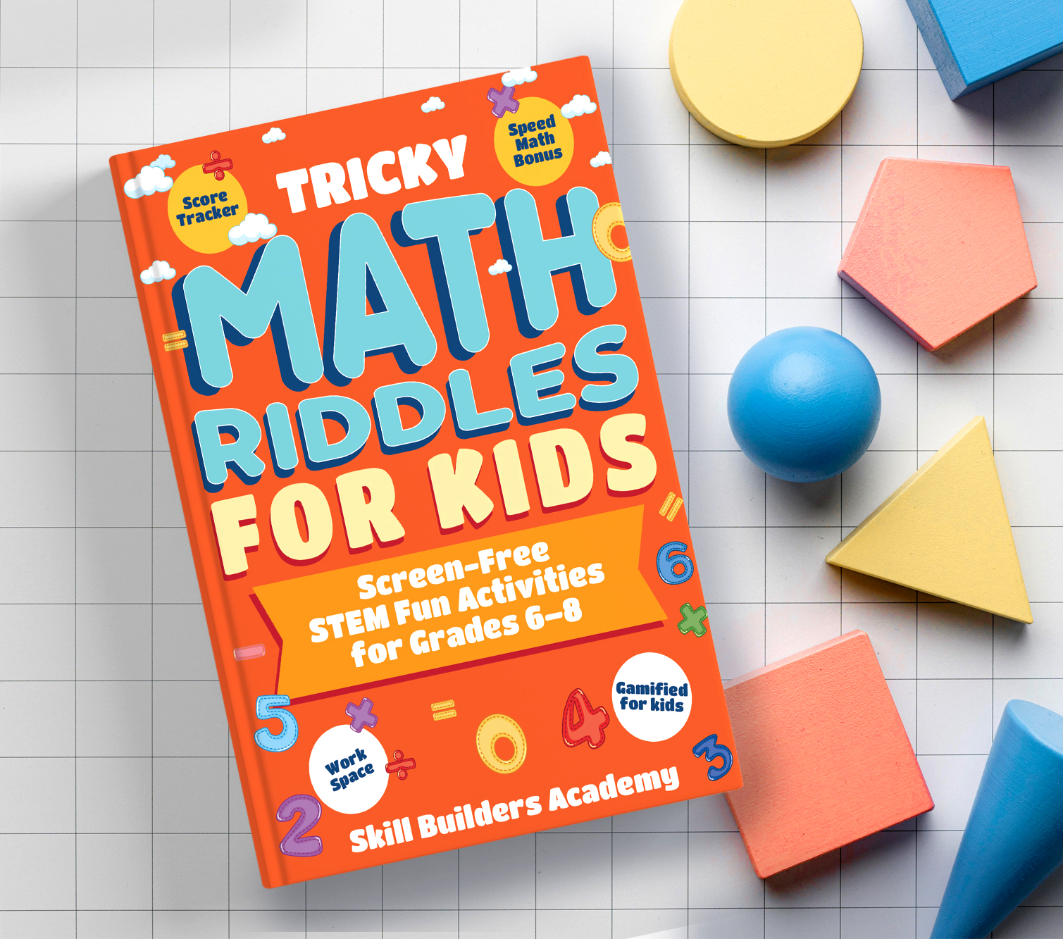
The design process began with defining a playful yet educational tone suitable for middle schoolers (Grades 6–8). Bright, energetic colors—mainly orange and blue—were chosen to capture attention and convey enthusiasm for learning. The typography combines bold, rounded letterforms to keep the design child-friendly and approachable, while emphasizing key words like MATH and RIDDLES for instant recognition.
To reinforce the STEM and gamified theme, math symbols, geometric shapes, and playful icons were integrated into the background and margins. These not only enhance visual appeal but subtly communicate the subject matter.